iApps Development Blog

Samsung Galaxy Tab Advertising
I don’t really follow the Android world too closely. It kinda makes my head spin with the number of OS versions, gazillions of device models from a multitude of sources and carriers. The TV ads usually go in one eye and out the other. I’m glad no one asks me for Android device advice because I wouldn’t know where to begin.
A lot of promotional activity these days focuses on tablets that want to carve a slice of the iPad market pie. I do know that Samsung is a player in this space, and the company has been plastering the TV air and cablewaves with advertising that is supposed to make us all want one of their gizmos.
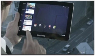
While watching some live TV last night (can’t skip over the ads, dammit), I saw one of the Samsung ads. Something looked a little weird to me, however. For most of the ad, the device’s bezel had an extraordinarily readable “SAMSUNG” logo on it. The logo didn’t look weird, necessarily, but the visual had a quality or size that made it look phony to me. Not imposterish phony, but Photoshop phony (or whatever program one uses to do CGI-like effects on video these days). Without the logo, the tablet being rotated and it’s-so-cool-excitedly manipulated by the human hands in the ad could have easily been mistaken for the tablet that almost everyone knows, the iPad (original recipe or 2). I wondered if the inclusion of the logo came as a post-production effect after Samsung’s ad agency ran tests of the ad, only to hear viewers thought the gizmo was an iPad. At the end of the ad, when they showed the devices in still frame, the logo was mysteriously absent from the devices, while it appeared clearly in text superimposed on the entire shot. Thus, Samsung was able (at last) to associate its identity with the device even if the device, itself, isn’t so labeled on the front.
(Now You See It)
It’s no mistake when a design is immediately identifiable through only a brief glimpse or even just a silhouette. Clayton Miller’s blog piece about the shape of different mobile OS app icons noted this a couple of months back. But the thickest connection to this concept hit me some years ago from watching The Simpsons DVD sets with the commentary tracks. One of Matt Groening’s precepts about character design is that the character should be identifiable just from a silhouette. That jagged flattop haircut of Bart’s is instantly recognizable, as are the outlines of all the main characters.
Has the iPad design become so identifiable with Apple’s brand that other makers have to go out of their way to distinguish their “wannabes” from the “is”? Maybe.
I visited the Samsung web site to see what the logo-on-bezel situation really is. I must have been napping the past few months because I discovered that Samsung talks about no fewer than three different models, each a different screen size. (“Oy!” my developer voice said.) Only one of them — not yet available from what I could tell — has the Samsung logo on the bezel. The others are logo-free.
Apple’s choice for its iOS devices is to place the company logo on the back of the device. A device’s user apparently already knows it’s from Apple, so let others who enviously watch the owner flip and tap and swipe his or her way to nirvana know who made the magical device.
Oh, and notice how the Apple logo is just a silhouette.
Friday, September 9, 2011